02. Scatterplots and Correlation
L4 021 Scatterplots And Correlation V2
Data Vis L4 C02 V1
Scatterplots
If we want to inspect the relationship between two numeric variables, the standard choice of plot is the
scatterplot
. In a scatterplot, each data point is plotted individually as a point, its x-position corresponding to one feature value and its y-position corresponding to the second. One basic way of creating a scatterplot is through Matplotlib's
scatter
function:
plt.scatter(data = df, x = 'num_var1', y = 'num_var2')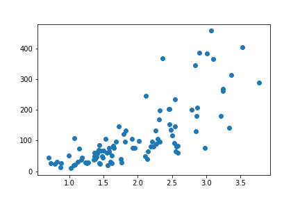
We can see a generally positive relationship between the two variables, as higher values of the x-axis variable are associated with greatly increasing values of the variable plotted on the y-axis.
Alternative Approach
Seaborn's
regplot
function combines scatterplot creation with regression function fitting:
sb.regplot(data = df, x = 'num_var1', y = 'num_var2')
The basic function parameters, "data", "x", and "y" are the same for
regplot
as they are for matplotlib's
scatter
.
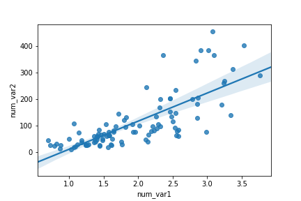
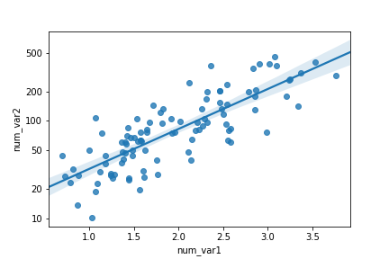
By default, the regression function is linear, and includes a shaded confidence region for the regression estimate. In this case, since the trend looks like a
\text{log}(y) \propto x
relationship (that is, linear increases in the value of x are associated with linear increases in the log of y), plotting the regression line on the raw units is not appropriate. If we don't care about the regression line, then we could set
fit_reg = False
in the
regplot
function call. Otherwise, if we want to plot the regression line on the observed relationship in the data, we need to transform the data, as seen in the previous lesson.
def log_trans(x, inverse = False):
    if not inverse:
        return np.log10(x)
    else:
        return np.power(10, x)

sb.regplot(df['num_var1'], df['num_var2'].apply(log_trans))
tick_locs = [10, 20, 50, 100, 200, 500]
plt.yticks(log_trans(tick_locs), tick_locs)
In this example, the x- and y- values sent to
regplot
are set directly as Series, extracted from the dataframe.